
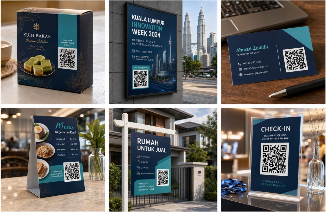
QR Code Design Best Practices for Reliable Scanning
A QR code is functional technology inside a visual design. Branding can improve recognition, but every decorative decision should preserve the scanner’s ability to detect modules and orientation patterns. The most successful designs are often restrained: strong contrast, clear spacing, an obvious instruction, and a destination users trust.
Prioritize Contrast
Use dark modules on a light background. Check the design in grayscale because two colors that look different may still have similar brightness. Avoid transparent backgrounds over photography unless the code sits on a solid panel.
Protect Critical Patterns
Do not distort or cover the large finder squares. If adding a logo, keep it modest, use error correction, and test carefully. Rounded or stylized modules can work, but extreme shapes reduce reliability.
Reliable Design Rules
- Keep a generous quiet zone around all four sides of the code.
- Use strong contrast between the code and its background.
- Avoid stretching, skewing, or placing a logo over important modules.
- Test the code at the real size and viewing distance before publishing.
- Keep the destination page fast, mobile-friendly, and relevant.
- Keep the code square and preserve its proportions.
- Use a short instruction that explains the benefit of scanning.
Branding Element Risk
| Element | Risk level | Advice |
|---|---|---|
| Color change | Low to moderate | Maintain strong luminance contrast |
| Small center logo | Moderate | Use error correction and test |
| Patterned background | High | Place the code on a solid panel |
| Heavy module reshaping | High | Use restraint |
| Gradient | Moderate to high | Ensure every module remains distinct |
Integrate the Call to Action
A code without context can look suspicious. Add “Scan to Book,” “Scan for Menu,” or another clear instruction. Leave visual separation between the label and the quiet zone.
Choose the Right File Format
Use SVG for professional print layouts and PNG for web pages, presentations, and office documents. Avoid JPEG because compression can soften module edges.
Build a Test Matrix
Test multiple phones, distances, lighting conditions, print samples, and final materials. Include at least one older device and test with both the built-in camera and a common scanning method if the campaign is important.
Frequently Asked Questions
Can I use brand colors?
Yes, provided the code remains clearly darker than the background and passes testing.
Can I place a logo in the center?
Often yes, but keep it small, use error correction, and test the exact final output.
Should I remove the white border?
No. The quiet zone is important for detection.
Is a gradient safe?
It can be, but uneven contrast increases risk. Simple solid colors are more reliable.
Why should I avoid JPEG?
JPEG compression can introduce artifacts and soften the sharp module boundaries.
Create Your QR Code with EasyTools
Ready to put this guide into practice? Use the EasyTools QR Code tools to create a clean, scannable code for QR code design best practices. Check the destination carefully, test the code on more than one phone, and download the format that best matches your digital or print project.